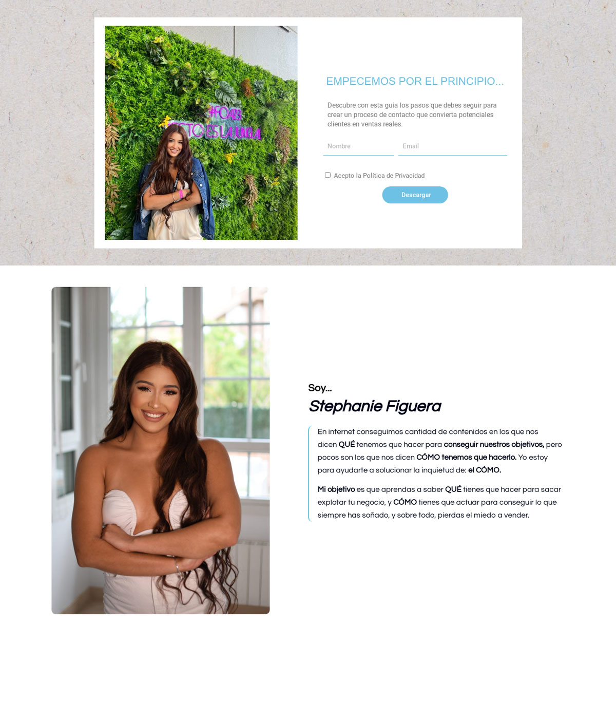
WordPress – Elementor Beautiful Website Design – stephaniefiguera.com

Funnel Ratings
| Criteria | Rating | Stars |
|---|---|---|
| Hero Section - Headline with strong benefit & hook, powerful design | 5/10 | ★★★★★★★★★★ |
| Hero Section: Subhead which expands upon the benefit and/or identifies target audience | 5/10 | ★★★★★★★★★★ |
| Hero Section: CTA (Call To Action) | 8/10 | ★★★★★★★★★★ |
| Hero Section: Social Proof | 0/10 | ★★★★★★★★★★ |
| Hero Section: Image/video | 8/10 | ★★★★★★★★★★ |
| No Distracting Links/Focus/Flow | 10/10 | ★★★★★★★★★★ |
| Colour | 8/10 | ★★★★★★★★★★ |
| Not Over Designed | 10/10 | ★★★★★★★★★★ |
| Proportionality | 6/10 | ★★★★★★★★★★ |
| Mobile | 5/10 | ★★★★★★★★★★ |
| Load Time | 2.32s (9/10) | ★★★★★★★★★★ |
Funnel Review
Hero Section Ratings
Hero Section – Headline/Hook: 5/10 – The headline is somewhat compelling but lacks the strong impact needed to immediately grab attention and convey the primary benefit effectively.
Hero Section – Subheadline: 5/10 – The subheadline expands on the benefit but does not clearly identify the target audience, which could enhance relatability.
Hero Section – Call to Action (CTA): 8/10 – The call to action is clear and visually appealing, encouraging users to engage, though it could be more prominent in the hero section.
Hero Section – Social Proof: 0/10 – There is no social proof or testimonials present in the hero section, which detracts from credibility.
Hero Section – Compelling Image or Video: 8/10 – The images used are appealing and relevant, enhancing the overall engagement of the page.
Design and Usability Ratings
No Links: 10/10 – The page maintains focus with no distracting links that could lead visitors away from the main offer.
Colour: 8/10 – The color scheme is well-executed, providing a visually pleasing experience while guiding the viewer’s attention effectively.
Not Over Designed: 10/10 – The design is clean and straightforward, ensuring that the message remains clear without unnecessary distractions.
Proportionality/Design Principles: 6/10 – There are some inconsistencies in font sizes and spacing that could be improved for a more polished look.
Flow: 10/10 – The content flows logically from the hero section to the CTA, effectively guiding the visitor through the page.
Mobile Optimization: 5/10 – The page is somewhat optimized for mobile, but there are areas that could benefit from further refinement for a better user experience.
Performance Ratings
Load Speed: 2.32 seconds – This load time is excellent, ensuring quick access for users and minimizing the risk of bounce rates.
Overall Focus
Focus: 10/10 – The page maintains a strong focus on the main offer, with a clear message and minimal distractions throughout.
Conclusion
The opt-in page for Stephanie Figuera is well-structured, with a strong emphasis on user engagement and conversion. While there are areas for improvement in the hero section and mobile optimization, the overall design and performance metrics position it as a solid example of an effective opt-in page.
Funnel Pros and Cons
Pros
- Clear and visually appealing call to action.
- Engaging images that enhance user experience.
- Fast load times contribute to a positive user experience.
Cons
- Headline and subheadline lack strong impact and clarity.
- No social proof present to enhance credibility.
- Inconsistencies in proportionality and design elements.
Keith Commins

Keith Commins is a seasoned funnel builder and founder of bestsalesfunnels.net, he is on a mission to help the world create lives of freedom with sales funnels.
He passionately believes in the mantra coined by Clickfunnels founder Russell Brunson, that you “are only one funnel from life changing success”.
Thats why he created bestsalesfunnels.net – a place which he aims to become your “one stop shop” for everything you need to know about funnels, from how to build them, how they should look, which platform is best for you, how to build your page to maximise conversions, the other miscellaneous – chapter and verse, the whole nine yards…you will find it all at bestsalesfunnels.net


